24 August, 2018

Just Some Thoughts About Artistic Processes


I've been experimenting with different mark-making techniques recently. Whilst I've always found success with using fine liners and markers to ink my work, I've often found them a little restricting when it comes to a nice line flow. The problem, as I see it, is that it's only the very tip of the fineliner that can be used to make a mark, whereas a traditional pencil can give you varying degrees of line weight, smoothness and density in many different ways.

This lack of fluidity can mean that the inking process extinguishes some of the energy held within the pencils. This is mainly due to the fact that I have to hold the pen a certain way - less like a brush and more like a - well - pen. Of course, control and patience is important when inking. Not everything can be a sketch. Figures, poses, landscapes, expressions, whatever the subjects are - need refining, in the same way a sculptor can take a raw mass of material, and carve something into it. Body language and form can usually do a lot more for expression of movement than the use of line - I prefer to show the trajectory of movement within a panel through spacial relations between things, over speed lines or 'blurring' movement. But it's easy to lose momentum when you have to keep concentrating on how you're holding the pen in case you might  fuck up the line, straight or curved.

I think the reason I've always been so fond of fine-liners is because it's a cheap(ish), dry, easy-to-use tool, that I've seen other artists use for inking more than other tools. I know that ink dipping pans and brushes are more famously used for inking, but the messiness and expenses involved can be a little intimidating. Especially if the room you're renting stupidly has mint green walls that are very good at showing up large splashes of ink.
Well, I'm out of that room and I've cracked out the old caligraphy pen and Indian ink, and attempted to get good at that. I still find the same problems with it as I've always had, namely, blotting ink all over completed sections of the drawing and ruining my fucking day. How do other artists avoid this?!
Another thing is the fact that you have to keep dipping the pen to get more ink. I'm getting used to it, but it did mean ruining lines, because the ink ran out, and getting more ink meant throwing off the amount being used, resulting in thicker lines that should be thinner to be more uniform. That said, it's pretty great to be able to change up the line thickness via pressure. I've always liked using line weight to give a sense of gravity to an image as well as lighting, texture or depth. It's also fun trying to make it all come together in a way that's visually consistent.


Aside from inks - by using graphite sticks instead of conventional or mechanical pencils, I've been able to use the whole of the sharpened end of the pencil, as opposed to the lead point of a normal pencil. I've then been able to work into it with a mechanical pencil to bring out the deets. This looks good on smooth paper and I'm sure it looks great on textured paper too. However - graphite doesn't erase very easily, so it's not as great when trying to ink over the top of it, unless the graphite intends to be left there.


Experimenting with new materials is so important for comic artists. It's a super fluid process, this art malarkey, and your ideas of what art is to you should be changing as much as you do as a person. In comics, I think this is especially true. It can be easy for attitudes towards art to stagnate when too many people try to emulate Marvel comic styles, though I'll be the last person to say that admiration of a certain style is a bad thing.  I can look at my wall right now and see R. Crumb, Moebius, Frank Miller and Ralph Steadman-style art drawn by my own hand. Everyone starts out that way!

I think it stems from this idea that brand comes first for an artist in this online age, and people confuse that with style as an identity, which creates an echo chamber of style within online communities: copy-of-a-copy stuff. Comics are a very unique storytelling format, but it's vague enough of a concept that all methods of art can be applied to it, from fine art, to graphic design, to photography, to sculpture or performance art. Style is not as important as voice, in fact it's a consequence of voice. There are millions of artists out there with varying degrees of experience and abilities, and the ones that stick out are the ones with a clear indication of voice.
While there's a very clear style that is successful, it can be easy when looking at a wall of comics to think that only one way of drawing is the 'right' way. But just because the Jim Lees  and Rob Liefelds of the world have a similar commercial style, it doesn't mean that they don't have a ton of sketchbooks at home filled with personal visual experimentation. How else could they have created their style in the first place?
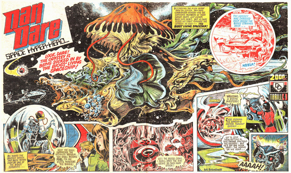
It's cool seeing how artists like Picasso or Goya changed their style based on their changing perceptons of their reality. Likewise, It's cool seeing how other comic artists have changed their style over the years to reflect their perspective of what comics are to them. Jack Kirby and Mick McMahon are two comic artists I think of that were like this.


Goya
Picasso


Jack Kirby

Mick McMahon


Even if artists return time after time to a certain technique that they're drawn to (pun not intentional), by exploring different materials, you get to visually represent things differently and develop your ability to draw and communicate too. Investing in a WACOM tablet is good, but so is investing in paper and charcoal.

05 February, 2018

Process: Ink Brush & Pen Techniques over Large Sketch


I was in a pretty chill place a couple weeks ago - I'd completed all my pages for Murder Most Mundane, and my laptop was in the shop being fixed. So I had a little window of free time and nothing online to distract me. So I used the time to finally experiment with certain mark making techniques that I've often touched upon but never really felt like I've made anything with. 

I've been thinking back to some of my inspirations who aren't based in comics. Ralph Steadman, Egon Schiele, Goya, Henry Moore - even musicians like Trent Reznor or Tchaikovsky. All these creative minds produce (or produced) very accessible art that stays with you, but are also pretty complex and multilayered, on a technical level. I probably sound super pretentious, but whatever. Their influences for their art obviously come from more than just the industry they work in - I think that's important if you don't want to work in an echo chamber, which is easy to do when everything online tailors to specific buzzwords. 
I love comic art (obviously) on Instagram, but as a lot of my searches for artists and subjects fall into certain categories like #geek or #popculture, the algorithm just wants to show me memes from comicbook movies all the time. I have to go out of my way to look for different types of comics or visual storytelling, and luckily I know other alternatives and where to search. I should probably just forget about Instagram and make a Pinterest board for inspiration. 
Actually, upon re-reading this post, these last paragraphs have nothing to do with drawing Wolverine in feral mode. But the point I think I'm trying to convey is that as someone who wants to work in comics, I don't want to dig all my inspiration out of the same, readily available pidgeon-hole resources online.

So I set myself a week long project to make something based on this. I also wanted to make something using my new giant sketchbook that I've been using to make roughs. It's my favourite thing right now. Working on big, shit paper really allows you to let loose, because you just don't care if the paper is ruined. Therefore you're less likely to hesitate and just make the lines that you want, regardless if it looks good or not. It's also really easy to erase pencils off.


Naturally, with wanting to mix sketchy ink lines and splats with crisp ruled lines, Wolverine seemed like the obvious subject. He's one of those characters that I always come back to sketching, and I think it's just that he has so much to offer. He's short and muscly, his face angry and covered in wrinkles and lines (which his healing factor would actually prevent from happening blah blah blah) and he has some of the coolest weapons ever. The ways in which he uses his claws allow for some great body language, with lots of good poses and contorting, flexing etc. Plus, there's something cool about this perfect, untouched metal, contrasted with oily hairy flesh, with bones and veins and imperfections. I always picture Wolverine having short claws, but having enough strength to throw his insanely heavy skeleton around. Imagine the momentum he would gain if he ran and jumped at you. Every swing of his fists would be like swinging a mace, regardless if his claws were popped or not.

Anyway, after  a couple of sketches and wasted pages, this was the most satisfying pose. Some good flexing in the arm and the thigh, a satisfying fist, depth, and a good feel of movement. 


Though the head sucked. I attempted something but it didn't work out. I ended up redrawing it.


Next up - another sketch. Since this paper was crappy, it wasn't going to take ink very well - something I learnt from some Murder Most Mundane prelim work. It's perfect for sketching because you feel so free and able to capture so much energy in the lines, but that's it. I simply took it to the window, and traced the pencil outline onto Bristol Board paper. 


The main thing that always happens with my work is I always lose something from pencils to inks. Some sort of energy that the pencils have never gets translated properly. So this time, I took some liberties with the inking, and focused more on the mark making as a gesture, than focusing on trying to nail form with slow lines. It kind of worked. The fist for instance, has the feeling of knuckles under flesh under fabric, but I made the lines in a quick fashion, whereas the claws were done with a ruler. The faces' form was the same process, but small marks to make bristles and hair etc. 
Marks are easier to make with a dipped ink pen, like I used here. Fine liners are great for precision and details, but for overall outlines and shapes, the fact that you can create a weight difference in line with the dipped pen's nib puts a whole new dynamic into the drawing. 
I also went into it with some white acrylic, though I might use Tip Ex or Whiteout next time. I find acrylic to be a bit translucent. It worked out pretty well though - I wanted to try it out for hair and for correcting mistakes on the arms. 


And here it is. Got some nice splashes of paint in there over the inks, used a brush to bring out the wild hair, and made some creases in the cloth. I went over the right arm a little too much with paint - but i tend to overwork things like that, so that's just another learning curve. I'm going to put a huge sticky note on my desk that just says "OK, STOP NOW".

Scanning this is was a pain in the ass. There were so many shades of grey in between the black and white, and I didn't want to adjust the layers too contrasty.


I decided to colour it, as I had some lighting ideas I wanted to try out, namely on the face. You can see however, that I also fully darkened the left side of the chest. I originally wanted to ink this, but I chickened out, as I has made some cool marks with the pen, and I didn't want to risk overworking it again. I was also concerned that it would ruin the stubble on his face, but it worked out. 

There's a couple things going on here that I wanted to try out, and it they were pretty successful. For starters, the highlights on the dogtag and the claws, I think was pretty successful. 
The other is the soft gradients in general. Simple gradients, that are just one step up from flats, seem to compliment the inks best. No details get lost, and you're left to just deal with the highlights and secondary lighting, such as on the left knee and right arm and shoulder. 
The face worked out just fine, too. I didn't add any lighting marks on the inking as I wanted to focus on expression. Again, those soft gradients really give a feeling of form to the face, which is something I've been trying to nail for a while. Those eyes, too. They were originally going to be lighter, but that wouldn't work into the lighting rules the piece sets. But darker, shinier and redder seems to equal "crazy".

All in all another semi-successful project. I definitely want to mess around with inks and paint a lot more though. And that's it. I don't know how to end this post. Bye.


23 January, 2018

Fuck That's Right, I Have a Blog!


Turns out I'm as bad with maintaining a blog as I am sticking with my gym membership. Or remembering to take breaks while working, to eat. Turns out the only 'traffic' on this blog at the moment are from a couple of spam websites with massive, raw photos of genitalia , as I discovered while clicking the link in a family-friendly cafe one afternoon.

Lots of things have happened since I last posted! I won't get into the moving to Mallorca to become a teaching assistant. Or the illegal eviction and month of houselessness. Or the Translatlantic/European travel. Or the week working in a prison camp for privileged teens, who just brought me one step closer to sticking my nuts in a microwave and ensuring myself a cringe-free future.

Nah you're not interested in that shit.


What I can tell you about however, is what else art-related I've been up to - namely, getting a comic book gig and getting a digital and physical debut in an 80-page graphic novel!

(Before that, I just want to mention that I also got one of my strips featured in Dirty Rotten Comics #11 this September (available HERE.) I'm grateful to have been featured alongside such great UK talent, and also that my submission features a masturbation joke. Check it out.)

So the BIG thing - Murder Most Mundane. For the past year and a half, I've been working with Mad Robot Comics to create a murder-mystery comic set in the tranquil British countryside. With writers Matt Hardy and Ash Deadman, I've been creating page after page of violence, horror and character pieces.
In Summer 2017, we launched a VERY successful Kickstarter, and from then I've produced the cover, and helped shape the narrative, on a scale that I've never worked on before. Hopefully I will continue to work on more (shorter) projects in the future.

As an artist, I definitely learnt a lot while work on this. Firstly, I learnt the importance of research and planning before starting a final piece. Not that I ever jumped straight into a final piece without any preliminary sketches or tests, but when you're working on 7+ panels a page, on 80 pages, you need to make sure everything works out before starting something you maybe need to correct later.
Sketch after sketch, getting the right poses, the right expressions, the right references via photos, as well as going outside and observing things WITHOUT a camera lens. ACTUAL sketching of real life - perspective, scale, compositions, lighting. I did a lot more studying like this as the project went on. I've never drawn that many establishing shots, or anything that architectural for that matter. So learning how to plan an environment and draw from real life really helped my build a solid foundation that was believable in this fictional world.
After a couple days of coffee and low energy levels per page, you finally get the right layout that everyone's happy with. Then what?

Then you start the page.

Once I was done prelimming, wow. I've never stared so long at white paper, terrified with making that first mark. I know I'm not the only artist who's ever faced this fear. How the fuck do you recreate the perfect sketch again? The short answer is: you can't. Not really. A lot of that has to do with the pressure you give yourself to catch lightning in a bottle twice, but unless you're extremely skilled and talented as technical drawing, it's not going to happen - at least to me. So after a while, I started to create sketches that, while clear, really just captured the essence of what I was going to draw, through gestures and a less detailed version. Even later in the project, I switched my sketches from A5 sketchbooks to A3 sketchbooks, and from there I was able to create better imagery with a better idea of size. Besides, I was working on A3 paper, so it made sense. So once it came round to the final pencils, I was less stressed.


On the actual practical side, I used a lot of grey pencil on my white Bristol Board paper. The grey was fine except that I kept pressing too hard on the page, and I had real problems erasing it without taking off some of the inks. That was stressful. So I adjusted my approach to pencilling. I switched to blue pencil, which I already knew would be easier to remove via scanning and editing. But after a while, it got a little stale to work with. For starters, it was a mechanical pencil, as was the grey pencil. Turns out, while the line is super nice on the smooth paper, it's still easy to press too hard and it feels like there's less room to let go. When it came to the finals, I think that I was thinking too much about 'comic book art', even though my inspirations came, mostly, from other forms of art. I'm a huge fan of the art of Egon Schiele, the Glasgow Boys, R.Crumb, Moebius (the last two who are obviously from comics) and Ralph Steadman to name a few, but the one thing that happens when you focus too hard on your inspirations, is that you forget to be playful with the art. So, I switched back to grey pencil, but this time to a standard wooden pencil. I held it like a paint brush, and suddenly, I had a lot more life in my lines, and I was less afraid to deviate from certain aspects in the sketches on the finals.


Next: inking. Ah, inking. The most disheartening step of all. In the beginning, anyway. At least with pencil, you can attempt to erase lines. I have experience with line weight, and how to balance black and white, feathering etc. I use fineliners and markers all the time.
With fineliners and markers, you tend to feel that you're fucked if you make a mistake. As it happens, if you get adventurous (as you should, this is ART), white acrylic and tip-ex (or Whiteout) works great. The trick is to not overdo either the black or the white, and to keep the inking style consistent throughout the book. That's hard to do when you can see and feel your skill improving, but being able to reel it in is part of being professional - something else learnt from past commission over the last four years.

Next comes the digitising of the page. Been there, done that. 3 scans on an A4 scanner, stitch it together. Adjust levels and curves to match what you were going for on the original page in terms of mark making and line weight. Size it - to what, exactly?
Another problem I encountered that I didn't think about before, was the page dimensions. I even forgot about the bleed! Luckily, this only effected the first couple of pages, which were not in the US comic page dimensions, and were also easily fixed. For the rest, It was nothing but an extra couple of minutes pencilling out dimensions before starting the final page.


It's almost ready and I can't wait to see how it looks. With additional vibrant colours by Ed Bentley, there's going to be two editions released, one with colours and one without colours.
This is going to be...killer! ;)  ;)  ;)  ;)  ;)  ;)  ;)  ;)  ;)  ;)  ;)  ;)  ;)


09 December, 2016

DITKO UNLEASHED: A Steve Ditko exhibition in Palma De Mallorca (Of All Places)


So there's currently an exhibition on a selection of Steve Ditko's work here in Palma. Why Palma, I haven't the slightest idea - but I'm not going to ask questions about an exhibition on one of my biggest inspirations on my doorstep.

What I've always loved about his work is the awkwardness in which he draws characters. This is famously what got him the Spider-Man gig, and being able to look at these up close is such a delight. It's one of those things that makes you want to immediately draw over and over, using pens and markmaking and brush strokes to create the illusion of something being there. There was a selection of work there that I didn't even know existed - a collection of horror comics where he expertly uses ink wash to eerie effect. There's original art from the first Dr Strange comic and the famous Spider-Man scene where he's underneath a bunch of debris, barely escaping with his life. There's even a Fantastic Four story that he's inked, with none other than Jack Kirby having done the pencils. Real Life Kirby art! It's really a special exhibition.

Looking at this exhibition and reading up on Ditko has also made me appreciate the characters more, especially Dr Strange and Spider-Man, and part of that is because of the kind of man Ditko is in terms of both his art and his political opinions. Dr Strange is pretty cool, not just because he's the 'Sorcerer Supreme' who travels through dimensions protecting the Earth from forces we cannot physically or mentally comprehend, but also because he's a well-known recluse living in Manhattan who makes his living from his chosen craft, and is rather humble about it to the common person.

In other words, he's Steve Ditko.

People who need his services make their way towards Strange, and he does his job. I started thinking about Ghostbusters while looking at the pages of the first Strange comic. Ghostbusters is about shlubby blue-collar workers trying to get an extermination business off the ground, and they're so intertwined with 80's New York. The supernatural stuff that happens is really fun but the way that it's structured is that they just want to provide this service, and they're constantly being outed as con-men, hiring others who just want a job and aren't too invested in the details, environmentalists, city council etc.

Here's a great review by Red Letter Media - they also do a great commentary track on Ghostbusters 2.

Dr Strange's first issue deals with a guy making his way to Strange because he needs help with the supernatural, like a freelancer being approached with a job proposal. I would love to see Dr Strange having to deal with similar stuff in his Manhattan Sanctum.
"In this electrifying issue, Dr Strange tackles the horrors of invoices!"
"Dr Strange, I need your help with an interdimensional portal opening inside my ribcage! I don't have any money for this job but I can help give you some exposure, yeah?"

After reading this article about Ditko, I learnt more about his objectivism, and this added a new layer onto Spider-man for me. Everyone knows that Spider-man is a famous superhero, but people forget that the first Spider-man story isn't about a kid who becomes a superhero - it's about an average lonely nerd who gets superpowers, and then chases a career in wrestling. He then indirectly causes family tragedy through inaction and self-interest, and becomes a hero out of guilt. Peter Parker is like a tortured loner who, if he wanted to, would find it incredibly easy to throw away the costume and just make a ton of money. If it wasn't for his deep-rooted emotional attachment for loved ones and commitment to responsibility, regardless of his crushing burden to sacrifice a comfortable life of self-interest, it would be hard to say if he would be a likeable character at all. That was probably because of Stan Lee that he's a likeable and good-hearted character, with Ditko adding this extra depth.
It's interesting because Ditko has mentioned that a hero cannot be villainous in any way or else they are not a hero, even though most of Stan Lee's characters deal with being very well aware of the moral choices they are confronted with. Mr A, another Ditko creation, believes people are only good or evil, and would certainly be after Peter Parker for his active choice to not stop the wrestling burglar. Perhaps this is Ditko's idea for Spider-man, a way of exploring his own perspective on life by co-creating a hero who does a bad thing, but who is not a bad person. Who can say, since Ditko will never tell.

Whether or not Ditko or Lee had more influence on these characters seems to be pretty up in the air, and considering one of them is a recluse and the other is essentially a cartoon mascot, maybe nobody will ever know for sure. Either way, the exhibition is here until January, and it's well worth checking out.

13 July, 2016

Breaking News: Stop-Motion Monster Movies Are Awesome


Ray Harryhausen. You know the name.


If you don't, then:
1) shame on you.
2) watch the video above.

If you love big dumb monster movies, then you have a lot to thank him for. His work is the quintessential stop-motion magic, and has influenced a lot of my favourite monster-based entertainment, including Army Of Darkness, God Of War, Jurassic Park, Robocop, and a ton of Peter Jackson and Guillermo Del Toro films. He was also a damn fine illustrator, as seen here.
 
Of his massive filmography, I own two - Jason And The Argonauts and Sinbad And The Eye Of The Tiger. By the way, when I reference Harryhausen's films, I don't mean as a director but as the stop-motion artist. The FX in both of these have really stood the test of time, and most of Jason still works incredibly well from a film-making perspective. They both fall short, however, once the main female character suddenly falls in love with the hero for no reason, and does very little to advance the plot. Older films tend to drag around this point in their story.


But there's no denying that there's a certain charm about the use of those effects. For starters, we the audience knows that the creatures we are watching actually exist. They look like a physical thing that was filmed with a real camera be
cause it WAS a physical thing filmed with a real camera. Therefore, it'll always have that going for it over CGI. Good CGI is almost invisible to the audience as they engage with the story and characters, but bad CGI takes us right out of a film like nothing else.
For example, The Incredible Hulk (2008) is a decent film for the first 40 mins, but as soon as Hulk turns up on the campus scene, it's like watching Ace Lightning. Not to shit all over the hard work of the Rhythm & Hues FX team, CG artists get little to no acknowledgement outside of the industry, and there are some good shots, but overall it moved too cartoony for me, and the transitions between live action and CG shots were too distracting and obvious. I always thought the animation on the Ang Lee Hulk looked a lot better, even though the rendering and overall design really let it down.
But that's a whole other post.
I mean rant.
I mean waste of everyone's time.

(The director, of The Incredible Hulk, Louis Leterrier, also directed the remake of Harryhausen's Clash Of The Titans, and the same problems arise: too many Hollywood filmmaking cliches like shaky cam and blue/orange lighting that take you out of the time period, and overuse of CGI where it wasn't needed. Plus it was a pointless remake where a Greek character was played by a white guy with a shaved head and a thick Australian accent.)

But if they were to ever use stop motion and animatronics to create the Hulk, then at least there would be a handmade charm about his screen presence if it went wrong. Look at Mr Wink from Hellboy II: The Golden Army for a good example of using the appropriate methods.


It's hard to think of any examples of bad stop-motion because even Harryhausen's best works have imperfect frames - it's just a consequence of that process of FX. Perhaps, given the relatively simple film-making techniques of the 40's - 80's in terms of storytelling and camerawork, it was easier to mix stop motion with live action. Since the majority of Jason is made of a variety of wide to closeup still shots, the lack of camerawork on the stop motion segments blends into the film easier, helping the illusion. When the 'camera' is held onto bad CGI for too long the illusion is broken, and the same when the CGI camera holding onto even good CGI starts moving around like a video game, it's also broken.

Of course, the process is incredibly time-consuming compared to CGI so it's naive to think that a big American adventure epic will ever use stop-motion again. But imagine if a Hollywood film used stop-motion with modern green screen and camera technology. I think that it would work incredibly well! Companies like Aardman are still investing talent, time and money into the art form. New camera setups and filming techniques are always being developed, and 3D printing has made the model-making process a lot more efficient than it was half a century ago. Who knows what projects await us in the future...

25 May, 2016

Catching Up On Some Classic Sci Fi


Beer, Metallica's Kill 'Em All and 2000AD. That's a good Wednesday midnight if I ever heard one.

I've recently been reading Dan Dare: The 2000AD Years Vol. 1. I'm not really that familiar with DD - I know of his publication origins in Eagle, but I've never read any.  and while I've only finished the first storyline so far, I now have a new favourite artist - Massimo Belardinelli.


The future as we envision it today - cynicism and fears about the fate of humanity aside -  is very consistent. All technology is synergised, working together on user-friendly platforms. When I imagine the representations of this future on film, names like Minority Report, Star Trek 2009 and Ex_Machina come to mind. Everything is digital and sleek, made of variations of gorilla glass, white light and chrome. Their aesthetics are deceptively simple and pleasing to the eye, though somewhat sterile and lacking in character. I guess the closer we get to the future that all the great minds foretold through art and science, the more accurate that fictional portrayals of it get. 


But Belardinelli's work is so out there and intense! It encapsulates everything I love about vintage sci-fi. It's like a Wally Wood sci-fi strip took acid. It's not a completely analogue world like a Wally Wood sci-fi, the tech feels more post-2001 (probably because it is.) But there are space suits made of weird fabric, guns in leather holsters, creative alien designs and a very busy space backdrop. Lots of nebulae and cosmic energy. Each issue is only about 5-6 pages long so it makes sense to burn brightly and quickly. It means every issue structure is simple: 


  1. Splash page with colour, that pulls you straight into the action
  2. Next spread packs as much character and story as it can, and does it surprisingly well
  3. Final page ends on a big dramatic event or image, the events of which will be the splash page on the next issue.  


These spreads just make me want to draw forever. There's so much packed into each panel and page, and with so much energy and action. Reading this is like listening to a hardcore punk album, where every song is around 1 or 2 raw, intense minutes. That's kind of what all early 2000AD is like though -  I have a small collection that I found around charity shops and second hand bookshops, and they read like pulp fiction. The paper is cheap newspaper paper, and they feel like zines or something, as if they were photocopied at home and sold in record stores.

If you find yourself in the presence of 2000AD's run of Dan Dare, check it out!


(as a bonus, here's one of my favourite Sci Fi images ever by Frank Frazetta)


22 May, 2016

DEFCON 4 & new B-Movies!


In between being busy with commissions, projects present and future, and generally pulling together everything before moving away, I've found time to shop around. Rapture, a record shop in Witney, Oxfordshire UK (AKA home) has recently extended their shop vertically, creating a new record and DVD section upstairs. The music's great, lots of vinyls of various artists old and new. But even better - terrible movies! Lots and lots of terrible movies! These 3 DVDs I picked up for £2 is my recent purchase. Well, really only 3 - Invasion Earth doesn't work. I'll have to find it online.

I'm torn between Rollerball and Space Fury as to which one I'm more excited to watch. One has LL Cool J - but the other has fury. In Space.
I refuse to read up on these films or watch any trailers before viewing them, but I have a feeling that Rollerball is going to give off xXx vibes. You know, that early 2000's-type of film featuring nu metal and wicked-kool stunts, yo! I imagine lots of not-great CGI and a plot that has something to do with trying to squeeze a Matrix hacker story into a Running Man scenario. I can't wait. I bet the villain wears a black trench coat. I bet the main action scene takes place in a large boiler room, garishly recoloured in the kind of way they repaint sets that test audiences deemed "too dark".  Space Fury looks more late 80's/early 90's, and I imagine there'll be a lot of OK models and bluescreen explosions. It looks pretty bland, but for some reason I'm drawn to it. Maybe it's because the cover looks like Space Mutiny if it was infused with essence of Three Wolf Moon.

Now - I've been tricked by b-movie covers before, and so I've learnt to not get too excited by cool art. And I may have forgotten all I have learnt once I saw the art for DEFCON 4. Look at it! A story of astronauts of an orbital nuke platform who descend back to earth to find it a radiated wasteland is perfectly summed up in this entire image. The ship has some nukes missing. The astronaut corpse is stuck in sand, and behind it, a scene from Fallout.
Surprisingly, the opening to the film is really strong! We are introduced to three isolated astronauts who have been in space for almost a year. They are grumpy, horny and busy doing astronaut stuff. It;s low-key and unassuming. Suddenly, they witness the very thing they are up there to retaliate to. The one thing they've been dreading. As nukes fly towards the US, they panic and even hesitate, as they want to make sure that all the info they are receiving on board about the inevitable on Earth is legit before they make it rain plutonium. As they do, countries are wiped off the map, and even their home towns containing their families. We see the odd terrible explosion effect but this all takes place on the ship, and is dependent on character interaction. It's a scene that really works. In the hands of a more competent director, say, Ridley Scott or James Cameron, this would really pack a punch.
The biggest telling of if a film is lying to you is: have you heard of this film at all? Have you heard of any 80's sci-fi fans or experts bring up this film? Hell, have you ever heard a b-movie fan/blog/whatever recommend this film to anyone?

No?

Then there's a reason you haven't heard of it.

So it turns out nothing on the poster happens. Quelle surprise. This is what it looks like.


Yet another Mad Max/Day Of The Dead-type clone. The astronauts crash back on Earth to find people living in heavily radiated areas of woodlands and other isolated areas that don't require permits to film in. The main set is a shantytown of soldiers and heavily armed guards, with normal people turned into slaves.The ringleader is a rich private schoolboy psychopath who has charmed his way to the top, and for some reason people listen to him. Again, quelle surprise.

There are some funny lines and decent action sets. There's a great scene where the main weedy astronaut draws a gun out on some armed guards, catching them by surprise, but they catch on to his bluff, leading to the astronaut to do something he's obviously never done before. Some of the scene setups definitely make me think that this was supposed to be a much bigger and weirder film than was executed. In the end, it just doesn't feel post-apocalyptic enough. There's no sense that people are dying of radiation and there's just no motive in a lot of characters.
That said, it's worth checking out. It's low budget and cheesy, featuring some decent ideas, even if they're not explored properly. It's got enough going for it that makes it watchable with a few drinks and friends, and in the end, that's all b-movies need.

I have no idea what I want to watch next. I saw the first 15 minutes of Invasion Earth and was utterly confused and left with a screwed up face, made up of both dissatisfaction and bewilderment. Maybe that's next.